
Thursday, December 4, 2014

Tuesday, April 15, 2014
My conversation with FSU's Athletic Department

Many folks contacted me afterward and today asking if I was ok and, of course, how it went. My delay in posting was actually mundane: I was sleepy and I had Life to do. I read every one of the e-mails I received from my last post (nearly 600 emails, and they're still coming!) and I needed to sleep. And do laundry. Because my husband and I were completely out of socks. This also is not my day job, or even my night job, really. I am not a writer. I barely know how to use a comma. And by barely, I mean not really at all. I am flattered though that so many of you poked me with a digital, internet stick to make sure I wasn't dead.
Ok, the good stuff. If you are a fan of spoilers (or tl;dr, too long; didn't read) skip to the last section.
I should preface: Athletics did not ask me to stay silent. They didn't threaten my job or me. They did not offer me anything, which was really really smart of them. By all accounts, the folks I met with were friendly Humans with kids and jobs and lives with no intentions of assimilating me into a creepy machine. They also did not ask me to cover for them, which is cool, since I was already not going to do that.
So, what did we talk about then?
The FSU Athletics representatives explained that this was a meeting to clear the air and be more transparent to me and those of you interested in what I have to say. This meeting was not at all about my alternate logo design. Zero. I was the only one to acknowledge it existed, except for one representative who vented about how annoyed he was to get a phonecall about it on his cell phone. I am not surprised at the lack of mention, just confused about the idea that they brought me there because I have some kind of Rebel Alliance I control. Nah man, just me and my computer. Well, and the thousands of ticked off fans and alums.
Here, translated into Jodi-speak, is what Athletics said:
Who was consulted (and who was not)
This process of FSU Athletics branding changes started a long while ago, long before the Coach's Trophy was a twinkle in our eye(s). Interestingly enough, FSU went to Nike asking to re-evaluate our Athletic identity. Their concern was that there was little uniformity in logos across sports. S
They explained that their process included former players, current players, current coaches, Seminole Boosters and the Seminole Tribe of Florida. Still not sure at which part of the process, but let's keep going. They told me a person at least somewhat related to each of these groups evaluated the logo at some stage of the process and the approval button was hit to unveil it. The Athletic Department feels that they did their due diligence in contacting and getting "approval" from each and every one of these groups.
The Athletic Department admitted that they never intended to include other fans or alumni (that do not work at the University) in focus groups. There was all but an eye roll to the idea of a fan polling because "you have to stop your focus group somewhere." Ok, then I strongly disagree on where you stopped it. In my profession, you have to communicate to your target audience to be effective. Their target audience was clearly only those on the "inside" of the University. High level folks. Top. Men.
The idea was thrown to me that the majority of fans, Boosters, and alums like the new logo but they're afraid to say anything. I know there are people who like the logo. I acknowledge they exist. Some of these people have personally contacted me, and I encourage that. Are they a majority? I don't think anyone knows that, even athletics. But what I can't do is refute an argument against a theoretical group of people, this "silent majority"they speak of. I could come out and say that one hundred thousand fluffy bunnies hate the logo, but until they type out e-mails with their little bunny paws you have no way of telling me they don't. Even though I can see it in their eyes. And their twitchy little noses. And you can't tell me I'm wrong.
"Subtle Changes"
The Athletics representatives explained to me that they believed, in their heart of hearts, that the changes they were making were subtle. Let's live in a world where that is accurate for a moment and keep going. They explained that, unlike other Universities that have more completely shifted their athletic logos, this was merely a retooling of a classic. Their example was Arizona State University in 2011. Ok, so let's look at what happened at ASU:
ASU went through an Athletics rebranding in 2011, the crux of which was to have the Trident instead of Sparky on the side of football helmets. But did they get rid of Sparky or change him? No. At least not without fan/alum input. The ASU news site lists groups included in their redesign process and a curious group comes up: fans. In fact, their fans vehemently disliked the new Sparky mascot costume redesign so much that they later went to a fan poll where the fans and alums chose the design. During their fiasco one fan even wrote:
“(We) support ASU 110 percent, but sometimes just can’t understand why ASU wants to change a good thing. Change isn’t always a good thing.”Yeah. We feel you. To bring it all home, the redesign at ASU was done by, you guessed it, Nike. FSU Athletics was also quick to dismiss MSU's Nike logo disaster as not at all similar to ours.
Can this logo change?
 |
| 583 e-mails, less than one day for me. |
So what will I do? Social media is the only tool we have to realize the changes we would like to see with our University's image. And I, with a real or imagined responsibility to those who have contacted me and still to share my opinion/support my redesign, will continue to carry the voices of so many to Athletics. I will continue to voice my opinions in a professional manner until I hear official statements from the groups athletics "consulted" during this design process. Then, and only then, will I just be a good girl. Because I do not think this is too big for us to change, but I cannot do it alone, and we cannot do it by just contacting Athletics. The folks in Athletics have been getting a lot of e-mails and phone calls about this. A lot. In fact, I printed nearly 600 of the e-mails folks sent me, spiral bound them, and personally handed them off. Is 600 a representative sample size? Of course not. But it is something, and I feel those e-mails, only five of which are in favor of the new logo, represent the majority opinion of fans and alumni.
This is not fun. For either side in this family feud. And it has, unfortunately, gotten personal on both sides. I really, honestly, wish it wouldn't. This has caused a rift in our Seminole Nation and it stems from institutional arrogance and, believe it or not, poor communication.
[Edit 4.16.14: I will reiterate that name calling is not cool in my book. Venting frustrations, fine. Directed personal attacks? Not fine and also not really effective. We're all Noles and will all be going to the same stadium when this is over, so let's not make it super awkward. Still...that doesn't mean I can't have an express an opinion.]
For more info, see the article posted online today on Tallahassee Democrat's website (in print on Monday, I believe) by Ira Schoffel. I also did a video interview with Paul Flemming of the Democrat talking about the amazing responses I've received and how it was just bananas. Like a whole bunch of bananas. Either way, thank you all for the love and support. Seriously.
Sunday, April 13, 2014
I'm meeting with FSU Athletics tomorrow and I want your thoughts!

I'll be doing my best tonight to get these all read, printed, and handed off tomorrow. Athletics and many other media sites feel this is a "vocal minority." I feel like the majority opinion is that folks don't like it but feel like the process is too far to change it back so we should get used to it. If that's what you feel tell me. And for goodness sakes tell me to my face. Shouting it to me as I walk by won't really work cause I won't catch everything you said and also I'll just kinda feel like you're being kinda cranky.
The internet is only one part of a larger community. If the majority of fans like this I would really like to know. However, I feel that is not the case, we're all just feelin' helpless to change. And helpless isn't and emotion that settles well with me. You know, what with the Unconquered spirit and all.
Thanks, Go Noles, and God save my inbox.
Friday, April 11, 2014
On the Spring Game and Who is Listening

The real question became how to express my distaste for the new logo at this weekend's Spring Game without looking like a total jerk. It would feel weird to boo my University, but the alternative didn't sound much better: silently seething, gritting my teeth and thinking "if you could read my mind you would know I am, like, so mad at you right now." I felt like I'd just end up walking around confused, smiling with my eyes and grimacing with my mouth, wondering what to do with my arms.
Then, through a conversation with someone about my last blog post, I learned some of the story behind this redesign. Let's just say it's kind of the worst, and it made me realize that I have to react in a public way.
Let's revisit
that pesky Athletics statement from last Thursday:
"It is very important for you to know that the refinement we are making to our Seminole Head logo has been under development for almost two years and that the Seminole Tribe of Florida along with groups representing our student-athletes, coaches, Boosters and university administration were consulted during the process."Someone with EXTREMELY close ties to the Seminole Tribe of Florida spoke of the situation to me where the words "approval" and "consulted" as used by the University are not exactly...exact. In fact, Athletics is the only one of the groups listed who has given an official response that I know of. With that much ambiguity as to what these other groups, like the Seminole Tribe, actually feel about the logo change, there is a real possibility that representatives are waiting for a reaction-- a sustained reaction-- from alumni and fans.
 |
| FSU Athletics' definition of "subtle": now with burning |
A great place to start would be the Rally to save the Chief going on at 1pm Saturday at the Unconquered statue. [EDIT 9:56 AM: I've been told there is also a protest of Ignition Tradition tonight at 6:30pm in Kleman Plaza, downtown Tallahassee] Snap a picture of your gameday gear and tweet to #KeepThisChief or #FSULogoRebellion. Sign the growing petition at Change.org which, as of right now, has nearly 15,000 signatures. Listen to Macklemore or Twisted Sister or even Miley Cyrus on repeat if that's what gets you going.
Important people are listening to our outcry. Very. Important. People. So at the Spring Game on Saturday, express your discontent in whatever way you want: visually, vocally, interpretive dance...whatever. But DO IT BIG. Because our voices and our actions are being heard.
Tuesday, April 8, 2014
Behind the logo design: Interview on The Morning Show with Preston Scott

Audio: FSU Artist Proposes Subtle Logo Design
Friday, April 4, 2014
FSU Logo Redesign: An Artist, Staff Member, and Alumna's Solution

Not sure what FSU Athletics thinks subtle means, but what they gave us was not it.
I have a unique position to complain: I have two degrees from this university, one in design. I currently work for the university as an illustrator, animator, and designer and have been happily employed here for three years, having graduated with my masters in illustration from Johns Hopkins University. I've been on this campus for eight of the past ten years of my life and, dadgummit, I deserve better than a cheesy, shoddy mishandling of my beloved Seminole.
I flamed on Facebook until my face was red, then said enough is enough. I had no right to complain as an artist, designer, and alumna if I couldn't find a better solution.
This post presents my solution.
While I had such a visceral reaction to the new design, there were elements that I agreed with: the text on the feather has never been easy to read or replicate, the color "garnet" means anything from apple red to Virginia Tech maroon, and the war paint does have that bacon-y feel to it. Which really, isn't the worst. Because bacon is awesome.
Let me be perfectly clear: my opinion is that our current FSU athletic logo should not be changed at all. However, seeing as how the powers-that-be are bent on revision and we already received a bungled redesign, the images below show my proposed updates to the logo. I will try to be as transparent as possible in what I changed, because it's pretty darn annoying to expect subtle and get, well, you know.
A side by side comparison of the current logo and my proposed updates:

For those fans of Highlights Magazine, look away and find the differences in the image above. For the cheat sheet as to what I changed, see below:
 My goal is to address the concerns released in the FSU Athletics statement on Thursday while also maintaining the traditional face of Florida State. Their statement on the Seminole Head reads:
To me, this clearly meant the feather. There was little consistency as to whether it said "Florida State" or "State" or nothing at all. Also, those little barbs always annoyed me when I tried to make the logo out of construction paper. Cause, you know, dorm decorating contests."The issue was that our Seminole Head, while as recognizable and iconic as any in all of sports, does not reproduce well in a number of mediums. It is particularly difficult to embroider and impossible to accurately represent on some materials including at midfield at Doak Campbell Stadium."
Here is how my proposed update compares with the design leaked by Tomahawk Nation:

"We tasked Nike for help in refining the logo so that consistency can be achieved without diminishing the identity of the iconic image"Yeah, you...did not succeed. I'm not sure who at Nike illustrated this logo or whether they're an FSU alumnus. Dollars to donuts they're not. The identity of the face was lost entirely. There's a story to that. Many of us know it and love it and yes, we did notice you changed it. [Edit 4.4.14, 6:44PM The illustrator apparently did not use Tommy Wright as the original face reference. He does admit though that the design migrated to a new profile since his original sketch (probably to incorporate Mr. Wright's striking features), I give full concept credit to the original illustrator, John Roberge, who worked in the FSU print shop in the early 1970's.]
The improved feather is nice and seems to be the exact one Nike used on the side of the men's basketball uniform redesign in the early 2000's. However, it was lazily slapped on straight across the circle, completely ignoring the circular flow of the profile, hair, and outer border. The designer seems to have kept it as straight and tall as a basketball player. Have you seen them? They're not circular at all. I amended this by curving the same design to follow the circle, allowing only his hair to break the circular design element on the bottom left.
I also noticed the teeny tiny interlocking FSU logo in the headdress and promptly removed it. Not sure what embroidery machine was going to get that on a polo (which is the reason we're changing this logo at all...right?), but it reeks of the same issues that the feather barbs had on the old design.
So, here it is, my take on this logo update business.

Saturday, January 29, 2011

Sunday, June 27, 2010
Complicat3D
The entire world seems to be busting into 3D everything these days (can't wait for NFL 3D, by the way), and I am no different. Well, mine's not really 3D. It's 3D in 2D images. It's complicated...D.
But how does one begin making a medical/science 3D thingamabob? Let us see!
First, I opened up a hemoglobin protein model from the handy dandy protein databank.
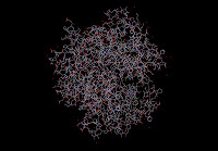 And it looks...like absolutely nothing. Super. But don't quit! This is just the un-pretty, data-type stuff. We're getting there.
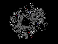 Looks more protein-y. Wait for it...color!
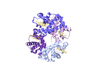 This is the "ribbon model" of the protein, but it isn't very exciting. To me, it looks like something that I curled with scissors for a birthday present topper. So I added some fancy pants lighting, atmosphere, speckles, and depth of field, movie style blurring to get this:
 Looks a little more Discovery channel now, right? We're following a de-oxygenated hemoglobin in a red blood cell! Now if I could only animate...but 3D studio max is not so easy. Case in point:
 This is what the screen looks like when I modeled a neuron from the brain. This is the screen where I continually claw at my computer, wanting to reach in and just grab the model and move it with my hands. Tony Stark, please get on that. From this strange wirey screen, I rendered out this:
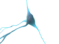 Eh, not so exciting. Put some of that fancy pants lighting and atmosphere in there and you get something much cooler:
 See those neurons zapping away, trying to figure out whether I should go to Subway or Chipotle for dinner tonight. Ok Subway, you win this time.
After my first few weeks of 3D class, I can see the merits of making a 3D illustration or animation. However, it is definitely not without its challenges. For example, you can't tell by looking at my finished pieces how many times I cursed at the computer and swore off art and grad school all together. Hint: the number is large. But somehow I end up remembering every Discovery channel doodad or Pixar movie that has me drooling and saying "I want to do exactly that," so I come back. I feel I need years upon years upon years of practice to even hold a tiny candle to the the entertainment industry regarding 3D. But God help me, I love the entertainment industry. And the entertainment industry loves 3D. So if a=b=c, then...
But how does one begin making a medical/science 3D thingamabob? Let us see!
First, I opened up a hemoglobin protein model from the handy dandy protein databank.
 And it looks...like absolutely nothing. Super. But don't quit! This is just the un-pretty, data-type stuff. We're getting there.
 Looks more protein-y. Wait for it...color!
 This is the "ribbon model" of the protein, but it isn't very exciting. To me, it looks like something that I curled with scissors for a birthday present topper. So I added some fancy pants lighting, atmosphere, speckles, and depth of field, movie style blurring to get this:
 Looks a little more Discovery channel now, right? We're following a de-oxygenated hemoglobin in a red blood cell! Now if I could only animate...but 3D studio max is not so easy. Case in point:
 This is what the screen looks like when I modeled a neuron from the brain. This is the screen where I continually claw at my computer, wanting to reach in and just grab the model and move it with my hands. Tony Stark, please get on that. From this strange wirey screen, I rendered out this:
 Eh, not so exciting. Put some of that fancy pants lighting and atmosphere in there and you get something much cooler:
 See those neurons zapping away, trying to figure out whether I should go to Subway or Chipotle for dinner tonight. Ok Subway, you win this time.
After my first few weeks of 3D class, I can see the merits of making a 3D illustration or animation. However, it is definitely not without its challenges. For example, you can't tell by looking at my finished pieces how many times I cursed at the computer and swore off art and grad school all together. Hint: the number is large. But somehow I end up remembering every Discovery channel doodad or Pixar movie that has me drooling and saying "I want to do exactly that," so I come back. I feel I need years upon years upon years of practice to even hold a tiny candle to the the entertainment industry regarding 3D. But God help me, I love the entertainment industry. And the entertainment industry loves 3D. So if a=b=c, then...
Saturday, June 12, 2010
You should read my blog. I hear it's getting better.
Needless to say, these past 8 months have been completely crazy. Our schedule is not set up in semester form but more in "project" form, where each new project (usually lasting a few weeks each) is a class. I both love and hate this format: rarely do I get bored with a class, but a lot of the time I feel like I'm trying to learn stick and can't shift the gears fast enough. If you've seen me attempt to drive stick, you know exactly how frantic that looks. On the bright side, I produced a lot of work over the past few months! Also, I can watch Discovery Health and feel like a super braniac. There is nothing like watching Mystery Diagnosis and making the diagnosis before the doctors do. I only did it once, but my nerd-self was beaming with pride.
Speaking of oogles of work, I have a recent project to post! The concept was to design an editorial cover for a medical/science journal. I chose to illustrate a cover for this article about electronic waste in our environment. I have my full process, from my first daydream doodles to the finished product. I love putting my process up, but I kind of feel like a magician telling all the secrets. Like this fun show I used to love. In a way, I am the new Magician X.
The finished product:
 The first stage was a doodle. I did this one very sleepy morning in the department. As you can see, it's rough. In doing thumbnails, I often ask myself if I can, in fact, draw.

Next step, a color comp from a beginning sketch. The idea begins to solidify a little bit, but it's clearly still a ghost of projects yet to come.

And now...my compulsiveness shows through. I've included oogles of wires, all of my old phone models, every piece of musical equipment I've owned (my favorite boom box) and every game console from N64 on. (This includes handhelds, minus the DS, Wii, and Sega Genesis. Throwing a Genesis away is blasphemy.) Find your favorite old piece of electronics (you may have to look at the pen and ink, it's more complete)!
 Next, time to ink! This was the most experimental part for me, since I haven't properly comic book inked. I've always wanted to since I used to draw my own Sonic the Hedgehog comics. This is my favorite stage.
 And from there, the photoshop coloring! ...which is the stage I'm going to abbreviate, since it's kind of involved. I have to say that I was inspired by (superhero) comic artist Steve McNiven. Oh, Marvel Civil War. So, once again, the finished product:
As you can see, the thumbnail is rarely like the original. This is not how I envisioned this would look in the end, but I am happier with this than the vision I originally had. (For example, the sky was going to be blue and the wires more black with light blue highlights. How weird!)
And that...is how this was made. Generally. Next time, some flashback artwork! Or perhaps, an entry on med school anatomy? The possibilities are endless.
Speaking of oogles of work, I have a recent project to post! The concept was to design an editorial cover for a medical/science journal. I chose to illustrate a cover for this article about electronic waste in our environment. I have my full process, from my first daydream doodles to the finished product. I love putting my process up, but I kind of feel like a magician telling all the secrets. Like this fun show I used to love. In a way, I am the new Magician X.
The finished product:
 The first stage was a doodle. I did this one very sleepy morning in the department. As you can see, it's rough. In doing thumbnails, I often ask myself if I can, in fact, draw.
Next step, a color comp from a beginning sketch. The idea begins to solidify a little bit, but it's clearly still a ghost of projects yet to come.

And now...my compulsiveness shows through. I've included oogles of wires, all of my old phone models, every piece of musical equipment I've owned (my favorite boom box) and every game console from N64 on. (This includes handhelds, minus the DS, Wii, and Sega Genesis. Throwing a Genesis away is blasphemy.) Find your favorite old piece of electronics (you may have to look at the pen and ink, it's more complete)!
 Next, time to ink! This was the most experimental part for me, since I haven't properly comic book inked. I've always wanted to since I used to draw my own Sonic the Hedgehog comics. This is my favorite stage.
 And from there, the photoshop coloring! ...which is the stage I'm going to abbreviate, since it's kind of involved. I have to say that I was inspired by (superhero) comic artist Steve McNiven. Oh, Marvel Civil War. So, once again, the finished product:As you can see, the thumbnail is rarely like the original. This is not how I envisioned this would look in the end, but I am happier with this than the vision I originally had. (For example, the sky was going to be blue and the wires more black with light blue highlights. How weird!)
And that...is how this was made. Generally. Next time, some flashback artwork! Or perhaps, an entry on med school anatomy? The possibilities are endless.
Thursday, October 1, 2009
Anatomical hiatus
So...I've been on anatomy hiatus for the past month. Longest month of my life? Yes. One more week and I'll be done. Look for a post all about it soon!
Tuesday, September 1, 2009
Anatomy, with help from Hollywood (PG)
A good summary of the past week would go something like this: Gross Human Anatomy at Johns Hopkins is no joke. It's the most interesting class I've ever taken, but I've never studied so hard or worried so much in my life. Learning anatomy is like learning a new language. Sure, the components haven't changed for hundreds of years (pollo still means chicken, right?), but that does not mean that it's easy to memorize hundreds of vocabulary words in one night. I mean, gastro-omental and pancreaticoduodenal are not excatly terms I use in everyday speech. Wearing scrubs does make me feel super official though.
Other than the intense terminology, class has been incredible. In our first week, we opened the thorax and dissected the pleural (lung) and mediastinal (heart) spaces. Cadaver dissection is not for the feint of heart. For example, here is a summary of how we excised the heart:

Ok, maybe we dissected more with scalpels in a lab than in the Temple of Doom with my fist. Still.
This week we are dissecting the abdominal cavity and, so far, it hasn't been quite so gruesome. We identified the inguinal ligament and the tendinous intersections of the recus abdominis, which are indicated on the living model in this photograph with red and yellow arrows respectively:
 Ok, ok, so I didn't have to use a scene from Troy to illustrate my point. But why not? Plenty of people appreciate Brad Pitt's inguinal ligaments.
I believe that this class is transforming me into a new class of super nerd. Not that I needed any help from Hopkins. I am beginning to see anatomy in everyday life, which could be a direct result of how much I am studying everyday (let's just say a lot). I was eating a snack while studying last week and, upon looking at the remains of said snack, immediately came to this conclusion inspired by Totally Looks Like:

To answer your question, yes, I was so excited by the similarity that I took a picture of a grape stem. Notice that the right branch is indeed shorter and bigger than the left branch as seen in the bronchioles in humans. Clearly, I have moved beyond mere "nerd."
Tomorrow we move into the abdominal cavity underneath the muscle layers. I'm hoping we don't find something like this:
 (This is the scene from Spaceballs because I thought the one from Alien was just a little too PG-13.)
Going through the cadaver is still fairly mindblowing. When I was little, I thought that my body was just magic. I put food in, it scrumbles around in there somewhere, and comes out the other side. I hear my heart beat faster when I'm scared and when I get cut, I bleed. If you had asked me to draw what my "insides" looked like, it probably would have been a huge cavity with teddy grhams and peanut butter sandwhiches at the bottom, one hole for the mouth and one for the "2." This class is systematically de-mystifying my own body. I'm still not sure how I feel about that because I still consider life miraculous.
Other than the intense terminology, class has been incredible. In our first week, we opened the thorax and dissected the pleural (lung) and mediastinal (heart) spaces. Cadaver dissection is not for the feint of heart. For example, here is a summary of how we excised the heart:

Ok, maybe we dissected more with scalpels in a lab than in the Temple of Doom with my fist. Still.
This week we are dissecting the abdominal cavity and, so far, it hasn't been quite so gruesome. We identified the inguinal ligament and the tendinous intersections of the recus abdominis, which are indicated on the living model in this photograph with red and yellow arrows respectively:
 Ok, ok, so I didn't have to use a scene from Troy to illustrate my point. But why not? Plenty of people appreciate Brad Pitt's inguinal ligaments.
I believe that this class is transforming me into a new class of super nerd. Not that I needed any help from Hopkins. I am beginning to see anatomy in everyday life, which could be a direct result of how much I am studying everyday (let's just say a lot). I was eating a snack while studying last week and, upon looking at the remains of said snack, immediately came to this conclusion inspired by Totally Looks Like:

To answer your question, yes, I was so excited by the similarity that I took a picture of a grape stem. Notice that the right branch is indeed shorter and bigger than the left branch as seen in the bronchioles in humans. Clearly, I have moved beyond mere "nerd."
Tomorrow we move into the abdominal cavity underneath the muscle layers. I'm hoping we don't find something like this:
 (This is the scene from Spaceballs because I thought the one from Alien was just a little too PG-13.)
Going through the cadaver is still fairly mindblowing. When I was little, I thought that my body was just magic. I put food in, it scrumbles around in there somewhere, and comes out the other side. I hear my heart beat faster when I'm scared and when I get cut, I bleed. If you had asked me to draw what my "insides" looked like, it probably would have been a huge cavity with teddy grhams and peanut butter sandwhiches at the bottom, one hole for the mouth and one for the "2." This class is systematically de-mystifying my own body. I'm still not sure how I feel about that because I still consider life miraculous.
Monday, August 24, 2009
Week Three into Four- Transition
Due to the new medical school curriculum at Hopkins, last week was kind of a hodgepodge of projects. We did not have time to make a second continuous tone (black and white) illustration, so we just ended up turning our hipbone drawings into illustrations. My illustration highlights the basic anatomy of the human hemipelvis and focuses on the three parts of the hip bone: the ilium, ischium and pubis.

It was a simple project to teach us about leader lines and basic layouts in illustrator. I think it came out pretty textbook/poster-y...so a success! Still strange to think that I drew that...
I much preferred the trip we took on Friday! We went to the Smithsonian Naturalist Center in Leesburg, VA, which is an incredible place (especially for artists and kids)! It's an overflow museum for the Natural History Museum in DC, so there are hundreds of specimens there. The good thing about this place is that you can touch and move the specimens to get a closer look. We took a class trip there to sketch the specimens all day (though I could have stayed and sketched for three days). They even have two polar bears and a bengal tiger. Super (nerd) cool.
These are just a few of my sketches from that day. They are all from taxidermied specimines, except the beetles, of course.
 Their avian collection is wonderful.
 I've always been fond of beetles. Drawing them. Not in real life. Eww.
 I still preferred the birds.
These were just fairly quick gesture sketches, not final pieces. Still very fun.
I suppose I should get back to my notes on the Thorax for tomorrows lecture and dissection. Anatomy will be the hardest class I have ever taken (and probably will ever take). It's time for me to get my old AP History and AP Biology study habits out of the closet, dust them off...

It was a simple project to teach us about leader lines and basic layouts in illustrator. I think it came out pretty textbook/poster-y...so a success! Still strange to think that I drew that...
I much preferred the trip we took on Friday! We went to the Smithsonian Naturalist Center in Leesburg, VA, which is an incredible place (especially for artists and kids)! It's an overflow museum for the Natural History Museum in DC, so there are hundreds of specimens there. The good thing about this place is that you can touch and move the specimens to get a closer look. We took a class trip there to sketch the specimens all day (though I could have stayed and sketched for three days). They even have two polar bears and a bengal tiger. Super (nerd) cool.
These are just a few of my sketches from that day. They are all from taxidermied specimines, except the beetles, of course.
 Their avian collection is wonderful.
 I've always been fond of beetles. Drawing them. Not in real life. Eww.
 I still preferred the birds.
These were just fairly quick gesture sketches, not final pieces. Still very fun.
I suppose I should get back to my notes on the Thorax for tomorrows lecture and dissection. Anatomy will be the hardest class I have ever taken (and probably will ever take). It's time for me to get my old AP History and AP Biology study habits out of the closet, dust them off...
Sunday, August 16, 2009
Week Two Recap- Carbon Dust Method
And so, the journey continues. I think I'm finally beginning to find my way around the department, which is both good and bad since I will be taking a break from assigned projects for the next couple of months due to Anatomy! Before that, however, I have to tweak my carbon dust hipbone drawing.
I really enjoy carbon dust as a medium since it's like a combination between drawing and painting. We used chemical grade carbon dust (looks like fine black powder) for brushing on and Wolff's Carbon Pencils for touch ups and finer details. I was partial to the pencil, of course, since I love fine line art.
Without further ado, the process! I took all of my photographs at the end of the day, so each one represents a full day's work.
 Day One: Background, background, background.
I used large complexion brushes and a Japanese Hake brush to lay down the background values first with the dust. It was a strange way of painting, since it takes a very long time to build up the correct value. The background alone in this picture probably took 50 or more washes with the brush. This is the most important step because if the value of the background is off, the entire bone and shadow area will also be off. It would still look good, but it would be a mistake that even an undiscerning eye would see as "just off."
 Day Two: "sculpting out" the bone
This was probably my favorite working day of this project. Once I laid the shadows in, I went back with a kneaded eraser (And various other erasers. I cannot live without this Stanford Tuff Stuff eraser anymore.) and took out the highlights on the bone and in the background. This was the first time the bone started to really take shape. I call it "sculpting" because it really felt more like I was pulling the bone out from the paper than putting it on top. Philosophical, I know, but it's the kind of thing that makes me super excited. : )
 Day Three: Refining
This was a dog day for me. I put much more detail into the area above the acetabulum (the big, dark hole) where there are a bunch of foramina (tiny,little holes) and also refined the blotches in the shadow. This day was all about transitioning from the general to the details. I'd rather not talk about it...

Day Four: Get your magnifying glass
Ok, so I didn't actually use a magnifying glass, but it was all about the details. As my teacher would say, this is the day it stops looking like "drift wood" and begins looking like a bone. This is where I got to use my lovely carbon pencils and Tuff Stuff eraser, my favorites!

Day 5: Critique Day
Here is the critique ready piece matted. I was incredibly nervous, not gonna lie. It's a little nerve wracking having all of the faculty, some of the most established and acclaimed illustrators in the country, looking at and critiquing your work. I survived though, with a much better idea about what I executed well and what I need to tweak (which thankfully isn't a lot!). Oh, in case you're wondering, I took this photo in overhead, florescent light, so it's not as good or dramatic as I want. : ( Still, gives you an idea though!
I just wanted to put this in here because I was thinking about it all week. I've been listening to Pandora radio stations all week (on my free Pandora app, which I love!) while I worked on my bone. By the end of the week, I actually found that I had different musical taste depending on which part of the bone I was working on...it was weird. I couldn't listen to the wrong kind of music or it would totally throw me off. So, here's the bone in terms of working music! Maybe you can tell which musical artist gives me the best inspiration. : )

As you can see, I listened to everything from classical choral ensembles by Eric Whitacre, to hardcore metal band Dragonforce to 50 Cent. So I have an eclectic taste in music...sue me. : ) There may also be some BSB featuring 90's pop in there too...guilty pleasure.
Next week, we will be oriented into the new anatomy building an laboratory. Beginning the last week in August it's goodbye studio, hello anatomy and dissection! But don't think that's the end of my drawings! I get to stick around at the end of class and draw from my cadaver. More to post on that later, I'm sure.
I really enjoy carbon dust as a medium since it's like a combination between drawing and painting. We used chemical grade carbon dust (looks like fine black powder) for brushing on and Wolff's Carbon Pencils for touch ups and finer details. I was partial to the pencil, of course, since I love fine line art.
Without further ado, the process! I took all of my photographs at the end of the day, so each one represents a full day's work.
 Day One: Background, background, background.
I used large complexion brushes and a Japanese Hake brush to lay down the background values first with the dust. It was a strange way of painting, since it takes a very long time to build up the correct value. The background alone in this picture probably took 50 or more washes with the brush. This is the most important step because if the value of the background is off, the entire bone and shadow area will also be off. It would still look good, but it would be a mistake that even an undiscerning eye would see as "just off."
 Day Two: "sculpting out" the bone
This was probably my favorite working day of this project. Once I laid the shadows in, I went back with a kneaded eraser (And various other erasers. I cannot live without this Stanford Tuff Stuff eraser anymore.) and took out the highlights on the bone and in the background. This was the first time the bone started to really take shape. I call it "sculpting" because it really felt more like I was pulling the bone out from the paper than putting it on top. Philosophical, I know, but it's the kind of thing that makes me super excited. : )
 Day Three: Refining
This was a dog day for me. I put much more detail into the area above the acetabulum (the big, dark hole) where there are a bunch of foramina (tiny,little holes) and also refined the blotches in the shadow. This day was all about transitioning from the general to the details. I'd rather not talk about it...

Day Four: Get your magnifying glass
Ok, so I didn't actually use a magnifying glass, but it was all about the details. As my teacher would say, this is the day it stops looking like "drift wood" and begins looking like a bone. This is where I got to use my lovely carbon pencils and Tuff Stuff eraser, my favorites!

Day 5: Critique Day
Here is the critique ready piece matted. I was incredibly nervous, not gonna lie. It's a little nerve wracking having all of the faculty, some of the most established and acclaimed illustrators in the country, looking at and critiquing your work. I survived though, with a much better idea about what I executed well and what I need to tweak (which thankfully isn't a lot!). Oh, in case you're wondering, I took this photo in overhead, florescent light, so it's not as good or dramatic as I want. : ( Still, gives you an idea though!
I just wanted to put this in here because I was thinking about it all week. I've been listening to Pandora radio stations all week (on my free Pandora app, which I love!) while I worked on my bone. By the end of the week, I actually found that I had different musical taste depending on which part of the bone I was working on...it was weird. I couldn't listen to the wrong kind of music or it would totally throw me off. So, here's the bone in terms of working music! Maybe you can tell which musical artist gives me the best inspiration. : )

As you can see, I listened to everything from classical choral ensembles by Eric Whitacre, to hardcore metal band Dragonforce to 50 Cent. So I have an eclectic taste in music...sue me. : ) There may also be some BSB featuring 90's pop in there too...guilty pleasure.
Next week, we will be oriented into the new anatomy building an laboratory. Beginning the last week in August it's goodbye studio, hello anatomy and dissection! But don't think that's the end of my drawings! I get to stick around at the end of class and draw from my cadaver. More to post on that later, I'm sure.
Wednesday, August 12, 2009
Week One Recap
Hello wonderful world of blogging! I am a current Medical & Biological Illustration Student at Johns Hopkins University in Baltimore, MD, and this is my illustration/sketch/art blog. See my title, MDArt? M.D. as in doctor and MD as in Maryland. Pretty clever, huh? I thought it was clever...
To be honest, I am not much of a writer at all. In fact, I'm a pretty horrible writer. So why have a blog? I am a huge fan of Drawn!, an illustration and cartooning blog I visit daily. They constantly update with links to artists' sites and blogs...of which I have neither! Seriously, you'd think a budding illustrator would have some record of her art on the web for someone to find! Second, when I was telling people I would start in August at Johns Hopkins for Medical Illustration, the most common reaction was excitement that slowly morphed into confusion. "Oh wow, Johns Hopkins! Now...what will you be doing again?" Hopefully this blog will shed some light on what exactly medically illustrators do.
I guess the best way to describe what they do is to show a current project! Our first assignment is a traditional continuous tone drawing of a hipbone. Every class has done this project since the program began 98 years ago. Although they began with different bones, these particular bones have been around for at least the past 30 or so years. Certain teachers will walk in, look at a piece in progress and say "Oh my gosh, that's my bone you're drawing!" It's kind of neat.
This is a photograph of my bone at the correct drawing POV: (my images are from my phone, so hopefully the colors aren't too bad with the light!)
 Aah, it looks so familiar to me this way. And now, for a sketch progression. I like to do these so I can see my process and refine it for later drawings.
Hipbone Week One-Preliminary sketch
Day 1: basic proportions
You would think this part would be easy. Just draw like I always do. Yeah, that's what I thought. However, the goal of this project is not to have what looks like a great drawing of a bone. It's to have a drawing so real and to scale that it looks like a photograph of the bone, with correct tone, lighting, and proportion. This means that our proportions have to be perfectly 1:1 with our bone, and all angles have to be correct. Here it is at the end of day 1.
 Day 2: refining
By this point, I'd made a ton of changes, but you'd never notice them unless I pointed them out, like the Obturator foramen (the big "loop" at the bottom of the bone). See how it's much longer and skinnier in this one? Perfect proportion is not easy!

Day 3: details, lighting and final sketch
Ok, now I was just showing off. This is just a prelim sketch, so it didn't have to be so detailed. But why not, right? At this point, the proportions are pretty spot on. It doesn't look much different proportion wise from the first one but, believe me, it is.
 After this step, I transferred the outline of my sketch on to a piece of Strathmore charcoal paper for the final drawing. By this point, I've put in almost 24 hours of drawing time on this one sketch, which is more time than I've put into any 11x17 drawing in my entire life. However, I think the proportion turned out really great, so it was worth it in the end. I would think after 100 years they have their process down for this assignment. Next post, I'll update with the carbon dust method we use to create the final drawing!
To be honest, I am not much of a writer at all. In fact, I'm a pretty horrible writer. So why have a blog? I am a huge fan of Drawn!, an illustration and cartooning blog I visit daily. They constantly update with links to artists' sites and blogs...of which I have neither! Seriously, you'd think a budding illustrator would have some record of her art on the web for someone to find! Second, when I was telling people I would start in August at Johns Hopkins for Medical Illustration, the most common reaction was excitement that slowly morphed into confusion. "Oh wow, Johns Hopkins! Now...what will you be doing again?" Hopefully this blog will shed some light on what exactly medically illustrators do.
I guess the best way to describe what they do is to show a current project! Our first assignment is a traditional continuous tone drawing of a hipbone. Every class has done this project since the program began 98 years ago. Although they began with different bones, these particular bones have been around for at least the past 30 or so years. Certain teachers will walk in, look at a piece in progress and say "Oh my gosh, that's my bone you're drawing!" It's kind of neat.
This is a photograph of my bone at the correct drawing POV: (my images are from my phone, so hopefully the colors aren't too bad with the light!)
 Aah, it looks so familiar to me this way. And now, for a sketch progression. I like to do these so I can see my process and refine it for later drawings.
Hipbone Week One-Preliminary sketch
Day 1: basic proportions
You would think this part would be easy. Just draw like I always do. Yeah, that's what I thought. However, the goal of this project is not to have what looks like a great drawing of a bone. It's to have a drawing so real and to scale that it looks like a photograph of the bone, with correct tone, lighting, and proportion. This means that our proportions have to be perfectly 1:1 with our bone, and all angles have to be correct. Here it is at the end of day 1.
 Day 2: refining
By this point, I'd made a ton of changes, but you'd never notice them unless I pointed them out, like the Obturator foramen (the big "loop" at the bottom of the bone). See how it's much longer and skinnier in this one? Perfect proportion is not easy!

Day 3: details, lighting and final sketch
Ok, now I was just showing off. This is just a prelim sketch, so it didn't have to be so detailed. But why not, right? At this point, the proportions are pretty spot on. It doesn't look much different proportion wise from the first one but, believe me, it is.
 After this step, I transferred the outline of my sketch on to a piece of Strathmore charcoal paper for the final drawing. By this point, I've put in almost 24 hours of drawing time on this one sketch, which is more time than I've put into any 11x17 drawing in my entire life. However, I think the proportion turned out really great, so it was worth it in the end. I would think after 100 years they have their process down for this assignment. Next post, I'll update with the carbon dust method we use to create the final drawing!
Subscribe to:
Posts (Atom)